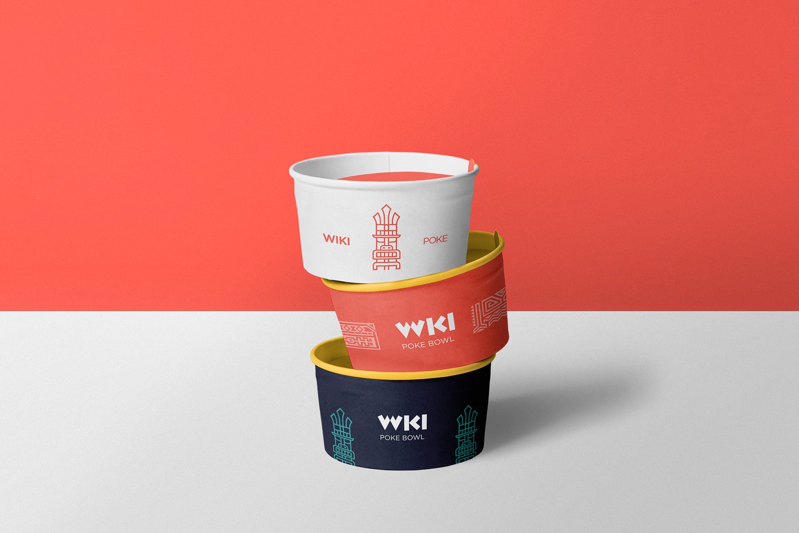
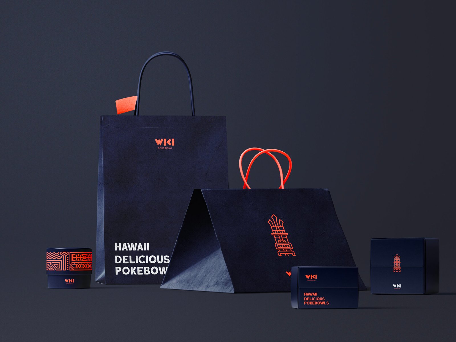
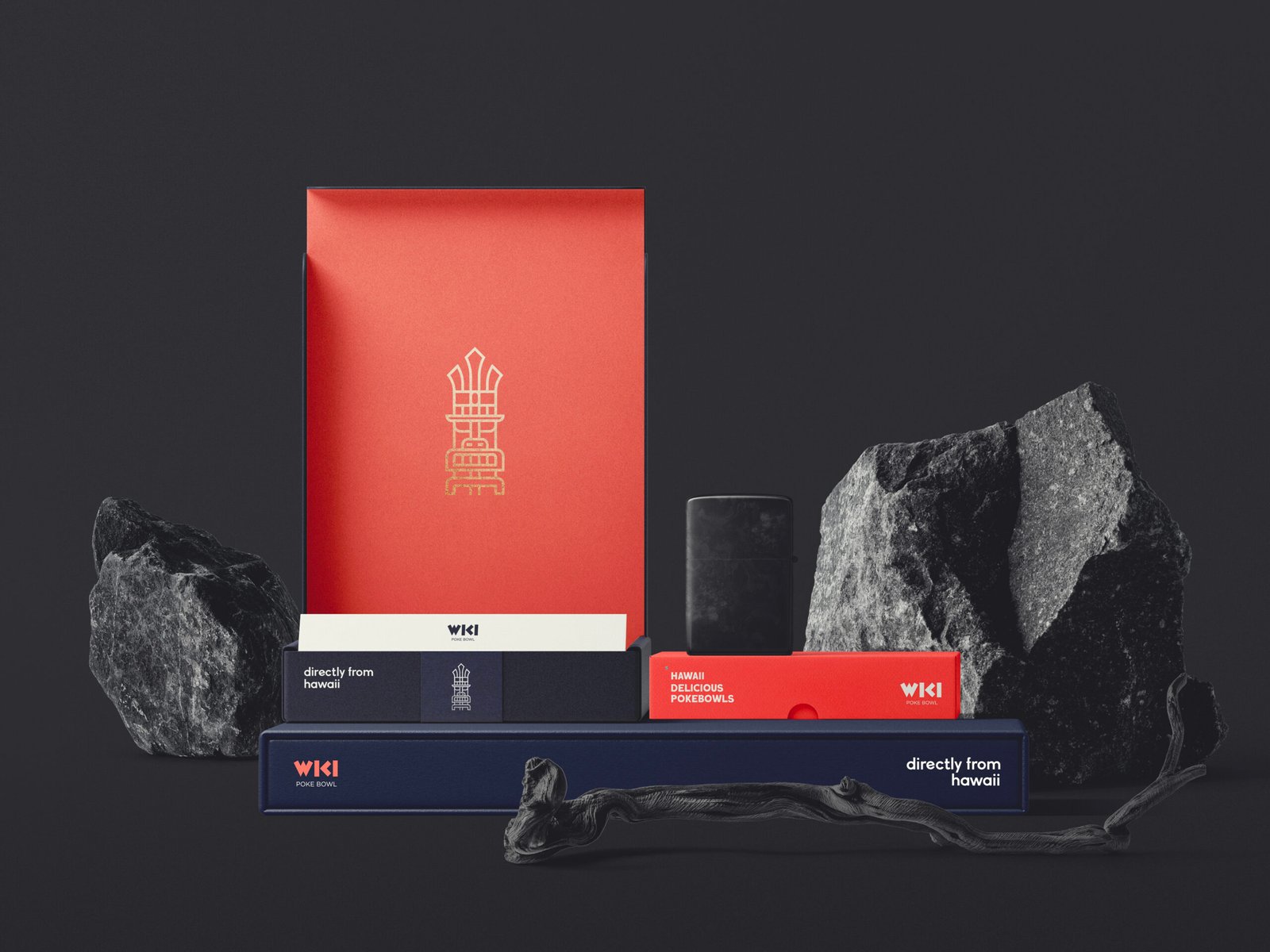
Identity design, naming, and packaging is what I have created for a business specializing in Poke Bowls. After a few brainstorming sessions, the name 'WIKI' was chosen, which, translated from Hawaiian, means 'quick' (a term characteristic of Poke, being a fast-food product).
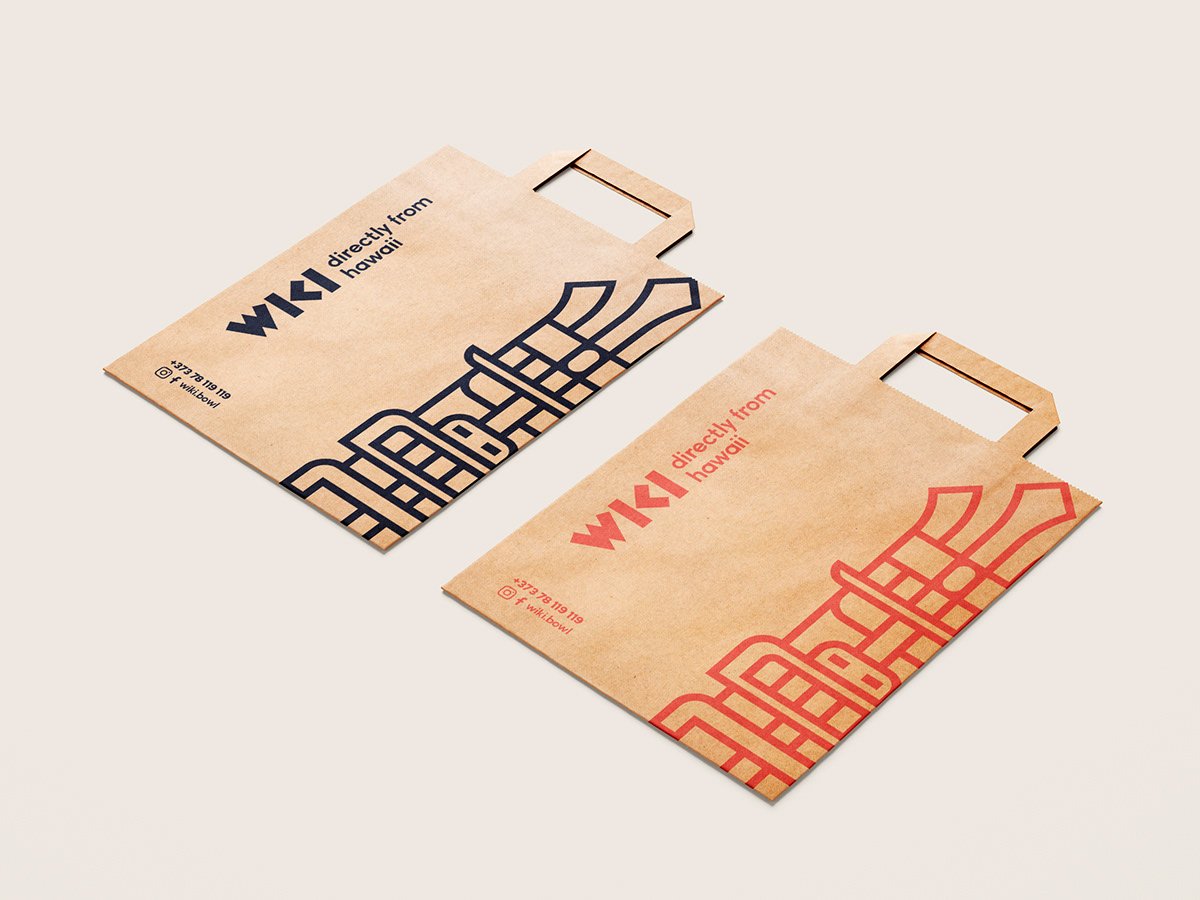
To strengthen the brand's philosophy and enhance its visual identity, we created a tiki – a Hawaiian spiritual symbol often representing the first human being on Earth. In our case, it embodies strength, courage, and power. Beyond its spiritual significance, the symbol's purpose is to make the brand more versatile and memorable, while offering abundant graphic opportunities.